
On Thursday night, fans across the globe powered up their televisions and began a 17-day fixation with the 2018 Winter Olympics. And while many will turn to Pyeongchang for the speed of downhill skiing or the power and grace of figure skating, the most exciting part of my Olympic experience was teased around 20 months ago, when the Olympic organizing committee announced that a white tiger named Soohorang would be the official mascot of the 2018 games and the 25th mascot in Olympic history.

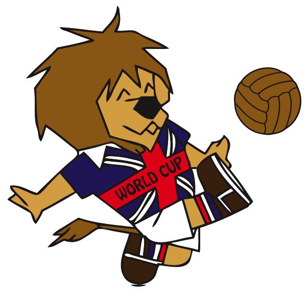
We’re living in the Golden Age of Mascots. Twenty-six of 30 NBA teams have mascots, as do 28 of 32 NFL teams, 27 of 30 MLB teams, and 28 of 30 NHL teams, not to mention hundreds of mascots throughout all levels of collegiate and high school athletics. Even other international events like the FIFA World Cup have mascots (though some are better than others). While my colleagues here at The Ringer break down the athletes and teams you should get to know as the Winter Games ramp up, I’m here to walk you, the mascot-loving people of the world, through the definitive ranking of Olympic mascots throughout history.
We’re judging the 25 mascots in three categories: Originality (is this a creative mascot design?), Pleasantness (is looking at it enjoyable, or is the mascot creepy?), and Good Hang (would this mascot be a good hang?). Let the games begin.
25. Schuss (Grenoble, 1968)
Originality: 1/10
Pleasantness: 1/10
Good Hang: 0/10
Total: 2/30
The first (and worst) Olympic mascot was the 1968 Grenoble Winter Olympics’ “Schuss.” The little man on skis kicked off the Olympic mascot tradition with his oblong head, fixed body, lack of functioning limbs, and terrifying jet-black eyes. It’s a wonder that host cities continued developing mascots after this frightening figure set the standard. I have never been more grateful for society’s advances in graphic design.
24. Misha (Moscow, 1980)
Originality: 2/10
Pleasantness: 1/10
Good Hang: 0/10
Total: 3/30
Misha, the 1980 Summer Olympics mascot, is a bear with perky ears, a belt made from the Olympic sigil, and a thousand-yard stare that says “I know I’m meant to look cute, but I have a secret.” Misha, whose full name is actually Mikhail Potapych Toptygin, might as well come with a hidden camera to spy on foreign journalists. I’m convinced the United States boycotted the Moscow games because Jimmy Carter was terrified of this bear. You cannot prove otherwise.
23. Neve and Gliz (Turin, 2006)
Originality: 0/10
Pleasantness: 3/10
Good Hang: 2/10
Total: 5/30
Ad executive: “OK, so people liked the mascots for the Athens games. What if we did something like that?”
Turin Olympics: “Yes. But they shouldn’t be too similar. We don’t want people to think we’re unoriginal.”
Ad executive: “Of course, of course. Something new and fresh. In Athens, the mascots who held hands were blue and orange. This time, blue and red.”
Turin Olympics: “YES.”
Ad executive: “And we’ll make the red one look like the Special K logo.”
Turin Olympics: YOU’RE READING MY MIND.
Ad executive: “AND WE’LL MAKE ONE OF THEIR HEADS A CIRCLE AND THE OTHER A FUCKING BLOCK.”
Turin Olympics: “Take all of our money.”
22. Syd, Olly, and Millie (Sydney, 2000)
Originality: 4/10
Pleasantness: 0/10
Good Hang: 2.5/10
Total: 6.5/30
There’s a concept in animation that describes realism on a spectrum from “not-at-all human-like” to “actual person.” At first, as the realism of illustrations improve, the drawings become more enjoyable to look at. But then something changes. The pleasure plateaus, and then it craters rapidly. The once-cute characters now seem too lifelike to be drawings and too cartoonish to be real. This is the uncanny valley. Enter Syd, Olly, and Mille, the three mutant mascots from the Sydney 2000 games. Selecting three animals that are native to Australia—a kookaburra, a duck-billed platypus, and an echidna—was a smart decision. Turning those mascots into nightmare fuel was not.
21. Sukki, Nokki, Lekki, and Tsukki (Nagano, 1998)
Originality: 8/10
Pleasantness: 1/10
Good Hang: 0/10
Total: 9/30
The Nagano mascots look like the creations of kindergarteners asked to draw what they thought owls would look like if they were in the “Yellow Submarine” music video. The agency behind these demons was also responsible for the far-superior mascots at the 2002 Salt Lake City Olympics. But more on that later.
20. Haakon and Kristin (Lillehammer, 1994)
Originality: 3/10
Pleasantness: 4/10
Good Hang: 4/10
Total: 11/30
Hansel and Gretel meet Berenstain Bears–era illustration. Pass.
19. Hidy and Howdy (Calgary, 1988)
Originality: 4/10
Pleasantness: 6/10
Good Hang: 3/10
Total: 13/30
Hidy and Howdy look like the inspiration for Beanie Babies, which wouldn’t debut for another five years. They were named Hidy and Howdy in honor of Calgary’s friendly nature. Howdy is literally short for “how do you do?”
Do less, Canada.
18. The Hare, the Polar Bear, and the Leopard (Sochi, 2014)
Originality: 3/10
Pleasantness: 7/10
Good Hang: 4/10
Total: 14/30
I actually don’t have any major objections to these mascots. They seem friendly, their blue accessories are fashionable, and they’re all creatures you’d expect to see in the snow. My problem with the Hare, the Polar Bear, and the Leopard is the way they were presented at the 2014 opening ceremonies.
Shudders. A note for all future Olympic planning committees: At some point, you might be approached by someone who thinks that technology has advanced to the point that giant skating animatronic mascots are usable. It hasn’t. Say no.
17. Schneemann (Innsbruck, 1976)
Originality: 4/10
Pleasantness: 7.5/10
Good Hang: 3/10
Total: 14.5/30
The Innsbruck mascot is a snowball with limbs and a hat, and “schneemann” means “snowman” in German. Pretty cool! The only reason Schneemann isn’t ranked higher is because of the inconsistency of its design. There are five fingers at the end of each of its hands but shoes on its feet. That hurts Schneemann’s pleasantness rating.
16. Sam (Los Angeles, 1984)
Originality: 6/10
Pleasantness: 7/10
Good Hang: 5/10
Total: 18/30
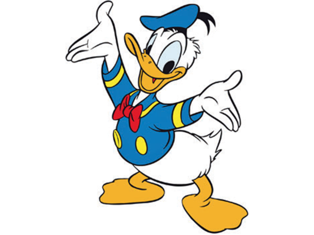
On the surface, Sam seems like a good mascot—a bald eagle with a nice smile, an inviting personality, and just the right amount of jingoism. Sam should be higher on this list, right? No. Look closer. The bowtie around Sam’s neck is almost certainly a clip-on, and that’s unacceptable. It’s not hard to tie a bowtie. Watch a damn YouTube video. I promise it’ll look better.
Also, I have a real problem with cartoon characters that wear shirts but not pants. To this day, I am frightened by Donald Duck.
15. Vinicius (Rio, 2016)
Originality: 9.5/10
Pleasantness: 5/10
Good Hang: 4/10
Total: 18.5/30
Vinicius isn’t a bad mascot, but the mishmash of a few Brazilian animals is nothing compared to Fuleco, the colorful armadillo who repped the country’s 2014 FIFA World Cup. Being the second-best mascot from a country in a two-year span is a bad look.
14. Magique (Albertville, 1992)
Originality: 9/10
Pleasantness: 7/10
Good Hang: 5/10
Total: 21/30
Per the official Olympic page for the Albertville mascot, Magique is an imp “in the shape of a star and a cube.” What that description does not explain is why Magique is standing over a pool of blood, smirking like it just got away with something nefarious, like a murder. I don’t trust this imp and neither should you. Originally, the mascot for the Albertville Games was supposed to be a mountain goat. That would’ve been better.
13. Roni (Lake Placid, 1980)
Originality: 6/10
Pleasantness: 8/10
Good Hang: 8/10
Total: 22/30
Roni is fine. That’s honestly it. It’s not good or bad. It’s just fine. It’s a raccoon from the Adirondacks. Roni was probably around during the Miracle on Ice game. Maybe it brought popcorn to share. Whatever, it’s fine. Moving on.
12. Wenlock (London, 2012)
Originality: 10/10
Pleasantness: 4.5/10
Good Hang: 8/10
Total: 22.5/30
A confession: I don’t know what kind of creature this mascot is. It looks like a sentient dollop of toothpaste from the Blade Runner universe. It wears the Olympic rings on its wrists like middle-schoolers in the late-aughts wore Silly Bandz. Wenlock’s lone eye is intense and menacing. Still, Wenlock is an above-average mascot. While most of the other entries here in the top half of these rankings were born from a conservative approach, Wenlock’s design shows ambition. And while the concept behind Wenlock might be a bit flawed—the shape of its head is supposed to resemble the three places on a medal podium—the designers should be commended for taking a swing. They flew out in deep right field, sure, but at least they took a cut.
11. Phevos and Athena (Athens, 2004)
Originality: 6/10
Pleasantness: 7/10
Good Hang: 10/10
Total: 23/30
Phevos and Athena are the only two Olympic mascots meant to represent actual gods. Sure, they look like Pokémon-human hybrids, and yes, they have disproportionately large feet and it’s hard to tell where their heads stop and their hair begins, but look at their faces! They look so happy to be here. At the end of the day, a mascot serves two purposes: to represent and welcome the games, and to help sell enough plush toys to offset the ludicrous costs of putting on an international sporting event. Phevos and Athena managed to fulfill one of those duties. We’ll let you figure out which one that was.
10. Hodori (Seoul, 1988)
Originality: 6/10
Pleasantness: 9/10
Good Hang: 9/10
Total: 24/30
Finally, a mascot that answers the question, What would it look like if Tony the Tiger wore a little hat and twirled a ribbon? Hodori is the guy from your freshman dorm who joined 12 different clubs at the student activity fair because he really wants to find a new hobby. Archery? Sure! Glee club? Why not! Dressage? Well, he’ll have to find a horse, but he’s very excited about the opportunity to grow. And yeah, he might be a little annoying at times, but that unbridled enthusiasm for life is just what we all need sometimes. Shouts to Hodori, the fun-loving tiger who’s here for a good time.
9. Amik (Montreal, 1976)
Originality: 4.5/10
Pleasantness: 10/10
Good Hang: 10/10
Total: 24.5/30
Without looking it up, how many people do you think were involved in the creation of Amik the beaver?
Did you guess four? Because the answer is four. Four people probably sat around a boardroom, looking at the black silhouette of a cartoon beaver, wondering what was missing before someone screamed out that they knew what was missing—a sash. That’s what would elevate this work from a dark blob to a piece of modern art.
Anyway, it makes the top 10 because it’s simple and beavers are highly underrated animals and their dams are feats of architectural brilliance.
8. Vucko (Sarajevo, 1984)
Originality: 7/10
Pleasantness: 8/10
Good Hang: 10/10
Total: 25/30
Vucko looks like a background character in a mid-’60s Pink Panther cartoon who just loves to watch curling and can tell you every member of the Yugoslavian giant slalom team. Is enjoying this mascot just another example of nostalgia for an Olympics I wasn’t alive to experience? Probably. But Vucko sure can rock a scarf.
7. Waldi (Munich, 1972)
Originality: 6/10
Pleasantness: 9.5/10
Good Hang: 10/10
Total: 25.5/30
Extremely good dog.
6. Soohorang (Pyeongchang, 2018)
Originality: 6/10
Pleasantness: 10/10
Good Hang: 10/10
Total: 26/30
Friends, meet Soohorang, the friendly white tiger you’ll be seeing over the next few weeks. Like fellow Korean tiger mascot Hodori, Soohorang looks welcoming, but has an edge. Look at those eyebrows. This tiger wants you to know it’s happy to have you here, but if you think you’re beating it in the biathlon, you’re sorely mistaken. Keep that rifle handy. You may need it.
5. Cobi (Barcelona, 1992)
Originality: 7/10
Pleasantness: 10/10
Good Hang: 10/10
Total: 27/30
When I look at Cobi, I don’t see a “humanised Pyrenean mountain dog, in a ‘Cubist’ style.” I see a bubbly biped with a little button nose and a grin that says, “Hey, why don’t you hang out for a while? We’ve got the game on the TV, and we just ordered some pizza.” Sure, Cobi might have only six fingers, an Olympic logo emblazoned on its chest, and a few strands of hair conspicuously greased down the front on its head like a Hot Topic customer suffering from male pattern baldness. Nevertheless, Cobi is a top-tier mascot because sometimes it wears an adorable suit like a pretend businessman, showing a versatility that not many mascots can pull off.
4. Izzy (Atlanta, 1996)
Originality: 10/10
Pleasantness: 10/10
Good Hang: 8/10
Total: 28/30
Let’s get this out of the way early: Izzy is the coolest Olympic mascot. It has lightning bolts for eyebrows, Olympic rings on its tail, Mickey Mouse gloves, and shoes that I would be too self-conscious to wear outside of my apartment. It’s even holding a torch that burns colorful stars instead of fire. So what’s holding Izzy back? Mainly the fact that nobody, including Izzy’s creators, knows what the mascot is. Per Izzy’s official page, it’s not an animal, a human, or an object. A little bit of mystery is intriguing. An overwhelming amount of mystery is exhausting.
3. Beibei, Jingjing, Huanhuan, Yingying, and Nini (Beijing, 2008)
Originality: 10/10
Pleasantness: 10/10
Good Hang: 8.5/10
Total: 28.5/30
These five mascots look like they were created to sell stuffed replicas, and honestly, it’s working. I revisited this design for the first time since the 2008 games ended and spent the next 20 minutes scrolling through eBay listings to see if I could find one to buy. (Spoiler: I did find one. And it’s adorable.) All five represent a “natural element,” and four represent animals native to China. The only thing keeping them from topping this list is that there are five of them, and I’m not convinced they’d be as enjoyable if there were fewer. Quality over quantity, always.
2. Powder, Coal, and Copper (Salt Lake City, 2002)
Originality: 9/10
Pleasantness: 10/10
Good Hang: 10/10
Total: 29/30
Powder, Coal, and Copper embody exactly what both the Sydney and Sochi games were trying to accomplish, but couldn’t. Three animals, distinctly cartoonish, but with enough humanity to make the goggles adorned by two of them seem normal, and enough charm to look loveable. Look at the rabbit sticking its tongue out! And the bear’s grin! If not for the banner informing us that these three are the official mascots (really? I thought they were competing), they’d take the top spot. Alas, they fall just short.
1. Quatchi and Miga (Vancouver, 2010)
Originality: 10/10
Pleasantness: 10/10
Good Hang: 10/10
Total: 30/30
Here they are—Quatchi and Miga—the two best mascots in Olympic history. Leave it to the Canadians to deliver such endearing figures. On the left is Quatchi, a sasquatch with dark brown fur, snow boots, and ear muffs. On the right is Miga—part killer whale, part bear—wearing a forest green scarf that accents its tiny ears. They both give a wave, welcoming all who pass to join in on the festivities. Plus, they had a little friend named Mukmuk who cheered on all the game’s competitors. They check all the boxes: They’re creative and original, they’re fun to look at, and boy, doesn’t seem like they’d be fun to spend a snow day with? So congrats to Quatchi and Miga, best mascots ever to grace the Olympic games.