On Wednesday, the XFL—a revival of Vince McMahon’s failed football league, which will return in 2020—moved one step closer to kickoff by debuting the names and logos of its eight teams. Friends, they are glorious.
As my colleague Rodger Sherman put it, the new XFL more closely resembles a conservative fever dream than it does the league’s past iteration. In his initial announcement of the competition, McMahon said players would be required to stand for the anthem, and XFL bylaws would dictate that any player who was arrested would be banned. Whether these policies will be implemented and enforced when the teams begin playing next spring is yet to be seen. For now, though, we can do what is necessary and right, and talk about these extremely kickass logos.
The best part about pop-up sports leagues is the names and logos. The Alliance of American Football, rest its soul, had names like the Arizona Hotshots and the Memphis Express; nothing too groundbreaking, but certainly better than whatever collection of birds and fighting cats fill the NFL’s docket. The XFL, which, as far as I can tell, does not stand for anything beyond “the XFL,” takes it one step further. Not only did the league release team names, but it dropped accompanying hype videos (we’ve included the colorful voice-over of each team’s video in italics). Some of these team designs are objectively awesome and original. Others are a bit derivative. With just months before the league opens for business, here’s our definitive ranking of the XFL’s new teams:
1. St. Louis BattleHawks
Winged warriors. Preparing for flight. Preparing to fight. They await their orders. Then attack as one. Diving, dodging, swooping, striking. Their mission: create chaos. Their mandate: win at all costs. The St. Louis BattleHawks. Cleared to engage.
The logo is a sword with wings. Per the XFL’s description, it can dive, dodge, swoop, and strike. And it’s worth noting that when it strikes, it strikes with a freaking broadsword. That’s probably fatal. And likely won’t bode well under the league’s “no criminality” law. Until the BattleHawks are all banned for sword-related murder, however, they take the top spot here. A BattleHawk sounds terrifying, the wings on the logo look like other, smaller blades, and the blue, silver, and white color scheme is clean and could make for some dashing uniforms. All in on the BattleHawks.
2. DC Defenders
On the shoulders of giants, they stand tall. Unconquerable. Unyielding. Marching ever forward. A force united. One quest. One purpose. One resolve. Seeking glory through grit. Victory through valor. The DC Defenders. Taking their stand.
The DC Defenders arrive with the most soccer-core crest, checkering their logo with crossed thunderbolts and a handful of stars. As the description says, they have “grit”—whatever that means. Also, they’re united. Huh, a soccer logo for a team in Washington, D.C., and they’re united. I think the MLS might have some interest in this.
3. Seattle Dragons
Rising from the turbulent sea. Beneath the darkening skies of their weather-hardened home. Relentless, ruthless, ravenous. Not of mythology, but of muscle and might. Not of folklore, but of football. This is your darkest fantasy, in cleats. The Seattle Dragons. Breathing fire.
The Ringer’s own Seattle native and Pacific Northwest zoology expert Danny Kelly offered this commentary on this logo: “I’m not sure what dragons and Seattle have in common. I’ve never heard anyone associate dragons with Seattle.” It was Portland, Seattle’s PNW rival, that rolled out a similar logo for its ill-fated Arena Football League team in the late ’90s.
Dragons are cool. Remember Game of Thrones? Drogon burnt down the knifey chair after the other two living dragons in Westeros were killed by a wicked ice javelin and a big crossbow. As long as neither is legal in XFL play, the Seattle Dragons should be fine, although I would look out for the BattleHawks if I were them. That sword looks mighty pointy.
An aside: Is dragon-based arson covered in the league’s “no criminality” rule? Even if it’s from dragonfire? Asking for a friend.
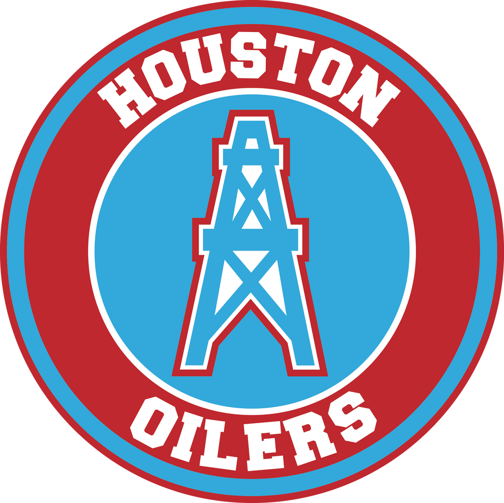
4. Houston Roughnecks
Resolute. Rippling with heat. Railing against fatigue. Unceasing and often unseen, they labor deep in the trenches. Mercenaries in the muck. Brawlers in blackened dirt. Not just for three hours. Not just when the lights are bright. These are the scratching, grinding, never-bending few. The Houston Roughnecks. Going to work for you.
This is just a straight-up reimagining of the old Houston Oilers logo. Not that there’s anything wrong with that. It was a great decal, and it’s a shame the franchise didn’t keep it for longer after it bolted for Tennessee to become the Titans. Explicitly throwing an H in the middle of the oil refinery is a nice touch. But it’s 2019, and we need more renewable resources. Halliburton is so last decade.
5. Dallas Renegades
Deep in the heart of Texas, beats a different kind of pulse. A spirit untamed. A swagger that can’t be denied. Where big meets bold meets badass. This is outlaw country, inside the lines. This is hell on wheels, between hash marks. This is their home on the range. The Dallas Renegades. Raising Hell.
The stars at night are big and bright, much like the blood-red eyes of the Dallas Renegades logo. This vigilante bandit looks like he spent the last decade of his life hunting for Anton Chigurh, and, unable to extract justice, has resigned himself to playing spring football against a collection of NFL washouts. Additionally, what does “This is outlaw country, inside the lines” actually mean? Those seem like contradictory ideas.
6. Tampa Bay Vipers
In the shadows they wait. Demons, born in darkness. Hunters by instinct. Cold-blooded by nature. Their bite, unavoidable. Their grip, inescapable. They slither and stalk their competition. Luring all who challenge them into the jaws of defeat. The Tampa Bay Vipers. Ready to strike.
A few years ago, I worked for a newspaper in Tampa. While living there, I ran into just about every kind of creepy critter imaginable, but I somehow managed to avoid crossing paths with any vipers or anacondas or any other kind of slithery creature. The Vipers’ logo is arguably the least exciting of the bunch, but points to Tampa Bay for at least repping its wildlife with pride. And before you tell me that vipers and anacondas aren’t native to that specific part of central Florida, let me say this: There is no limit to the damage Florida Man can do, be it losing a battle with super-snake hybrid pythons or leaving a shark in a Walmart parking lot.
7. L.A. Wildcats
In the land of bright lights. Far from the flash and fame. They’ve already begun to prowl. Enter their den and be dominated. Run away and be ripped apart. This is prime time meets primal instinct. This is showtime with a snarl. This is our time to roar. The L.A. Wildcats. Unleashed.
Points for keeping the logo simple and using a pretty pleasing aesthetic to stack L.A., but those same points are taken away for cribbing the design from the already successful LAFC. Additionally, if I wanted to support the wildcats, I’d have gone to Northwestern.
8. New York Guardians
Sentries carved of stone. Watchdogs over the metropolis. A prehistoric predator. A beast evolves, turned loose in a new kind of jungle. All teeth and talons, eyes unblinking. They know fear because they feed off it. They are your first line of defense, and there is no need for a second. The New York Guardians. On duty.
The name implies a police state. The logo is mad creepy. And honestly, I can’t figure out any connection between New York and a jungle cat. Does the XFL know that gargoyles don’t live in the jungle? They’re French statues. And the only French defender that frightens me is Raphaël Varane. Low marks all around for this abysmal logo.