
When pictures started appearing online of the rumored 2021 WNBA jerseys, you could be forgiven for being a bit skeptical. Surely the league wouldn’t have let previously unreleased jerseys start randomly popping up in Dick’s Sporting Goods around the country, right? Wrong!
Whether intentional or not, the leaks turned out to be a genius idea. Excitement blossomed as fans wondered when the jerseys would be released.
Well, the wait is over.
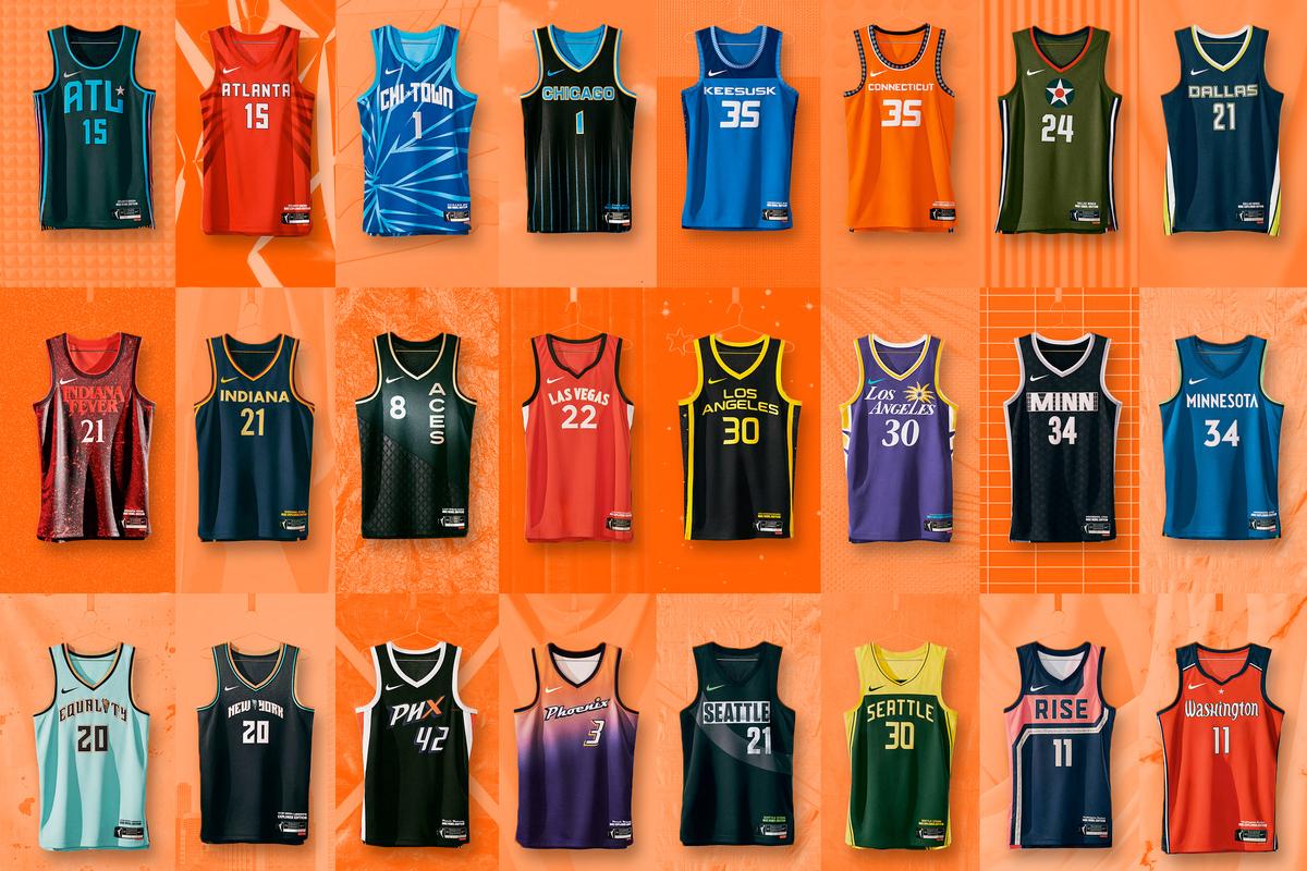
On Thursday, the WNBA and Nike revealed three jersey-and-shorts combos that teams will be suiting up in this year (as well as some really dope “Game Theater” sets that I will probably blow a paycheck on). Across the board, there are some really dope designs. And, as is tradition when something new drops, we have to bust out a ranking.
Before we start, I based my rankings on the following criteria: story behind the jersey design, overall colorway and scheme, and how those colors work with each other. Also, I will only be judging the “Explorer” and “Rebel” versions of the jerseys, as the majority-white “Heroine” jerseys are a bit more uniform (sorry) across the board.
Enough preamble, let’s get to it.
The Explorer Editions
1. Phoenix Mercury
Many of the “Explorer” editions are tamer than their “Rebel” counterparts, but no one told that to the Mercury’s design team. These joints are gorgeous. I love the creamsicle-esque gradient with the orange slowly transforming into purple, which is essentially reversed on the shorts. The colors are supposed to portray an Arizona sunrise, but all I can think about is a quick flash of orange and purple being the last thing you see as Diana Taurasi or Skylar Diggins-Smith dots your eye from beyond the arc. Or worse, you could get a real close look as Brittney Griner bullies you in the post.
2. Los Angeles Sparks
You just can’t go wrong with a classic. There’s nothing in sports quite like the Purple and Gold of Los Angeles, and the Sparks’ updated palm logo sprouting out of the elongated “L” in “Angeles” boosts this jersey up my rankings. I also love the turquoise for the swoosh and the wording on the bottom-right-hand corner of the jersey, which really adds some pop.
3. Connecticut Sun
I’m getting strong ’80s Cleveland Cavaliers energy here and I love it. Orange is an underutilized color in many jersey templates, but the Sun weren’t shy about using it to give them one of the most vibrant uniforms of the whole drop. The decals that rim the sleeves, neckline, and the edges of the jersey represent, per the team, the “Mohegan Creation story—from the 13 sections on the turtle’s back.” The deep blue on the edges of the jersey give it a nice, centered feel.
4. Seattle Storm
I’ve tried again and again to come up with a good word for these, but I keep coming back to “sharp.” The word “sharp” has wormed its way into my brain the same way “clean” did for the USWNT when their jerseys were released ahead of the 2015 World Cup. The Storm’s green and yellow colorway just works far too well for it to fall any further down this list. The deep green recalls the forests of the Pacific Northwest and the yellow pops.
5. Indiana Fever
Is it just me, or is anyone else getting strong Looney Tunes vibes here? I mean that in a good way. Maybe I’ve been staring at this page too long. Either way, I love the combination of colors here: simple, understated, and yet still eye-popping enough to draw attention on the court or the streets and have people ask you where you got it. I also love the use of gold across the chest and in the wording on the bottom of the jersey. This uniform also gets high marks for the 19 stars featured on the siding that, according to Nike, is an “allusion to the state flag and Indiana’s place as the 19th member of the Union.”
6. Chicago Sky
I love the idea here, but I can’t stop thinking about a large animal (maybe a Lynx?) dragging its blue claws down this jersey. The pinstripe look is iconic in Chicago and this is a welcome addition to that.
7. Atlanta Dream
Another really solid design here. The red is bold and impossible to ignore, no matter where you’re rocking this uni. Nike says they drew inspiration for the lettering from signs made during the civil rights marches, which is a great way to pay homage to the Dream and Atlanta’s activist history during the civil rights movement. All in all, a great step forward to push the Dream past the She Who Will Not Be Named Era and into the Renee Montgomery–led future.
8. Washington Mystics
This is where we start to get into the “Is this all that different from last year?” category. I can’t help but feel like this is more of the same from Washington, though I do really like the lettering on the front and the marble patterning on the sides. If it ain’t broke, don’t fix it, but this jersey just leaves me wanting a bit more.
9. New York Liberty
I’m personally very partisan to the mint green of the Liberty and wish the team had leaned more into that color here. The speckled patterning is nice and adds a bit depth to this uniform, but it’s a bit too monocolor for my taste. The touch of mint green and orange save this one from sliding further down.
10. Las Vegas Aces
The Aces have one of the best nicknames and color combinations in the sport, and I’d just like to see them a bit more here. Give me a bit of black or gold to break up all the red. There are diamond shapes all across the jersey, which may show up better in person, but I’m not feeling it.
11. Dallas Wings
I like the neon greens here and the lettering for Dallas, but it just reads as a bit boring for me. Not a lot to write home about here.
12. Minnesota Lynx
In last place, another jersey that goes for minimalism but just ends up boring. The highlighter green on the sides breaks up the uniformity of the jersey, but that’s about it.
The Rebel Editions
1. Indiana Fever
This jersey is top two and it ain’t number two. If I combined my “Rebel” and “Explorer” rankings into one list, this would be my top jersey by a mile. The concept is dope, the execution is amazing, and it’s the closest thing to make me want to watch Stranger Things since my friends demanded I do so a couple years back. If you don’t feel like getting one after this hype video, you’re wilding. Also Teaira McCowan is a badass and should be included in the next season of the show. That is all.
2. Chicago Sky
This jersey is so chaotic. I love it. Imagine Candace Parker getting buckets or Diamond DeShields putting you on a highlight reel in these. This is what happens when you aren’t afraid to take risks with your design and you just throw some shit at the wall (this is a compliment). This masterpiece low-key gives me Cubism vibes. Does that make sense? Does any of this make sense? It doesn’t matter, catch me trying to cop one.
3. Washington Mystics
Where do I even start with these joints? The design is stellar, everything looks like it has a purpose, and it creates a canvas that truly tells a story. It literally has the words and script of the 19th Amendment on it. And the colorway nods to the 2017 Women’s March. I love everything about these and need to see Natasha Cloud rocking these in the streets, expeditiously.
4. Las Vegas Aces
Now this is what I’m talking about, Vegas. Taking a bland, black jersey and cutting across it with a unique pattern. The gold screams royalty and opulence for me, and makes me excited to see how these look on the court. And if the team’s no. 1 superfan approves, who am I to disagree?
5. Connecticut Sun
The Sun, coming again with the heat. This jersey has plenty of details to dive into, but the shade of blue—inspired by medicine woman, anthropologist, author and Elder of the Mohegan Tribe Gladys Tantaquidgeon—is really unique. The other nods, from the canoes lining the neckline to the dotting on the shorts that represents the passage of time, make this one of today’s releases that truly embraces its history and does so with aplomb.
6. New York Liberty
As mentioned above, I love me some mint green, so this jersey is right up my alley. There are a lot of reasons to like this jersey, but it’s the “Equality” across the chest for me. The accents on the sleeve and neckline are also a nice touch. And the shorts are fire?! Catch me walking around Brooklyn this summer with a full uni on, ready to bust folks up on the court.
7. Atlanta Dream
These might seem like they belong in a city almost 700 miles to the south, but I really dig them. Maybe it’s the pink. Maybe it’s the dope pics that the team took with Courtney Williams, the Sauce Queen herself, that are persuading me. Whatever it is, the Dream took what could have been a dreary black jersey and turned it into a solid representation of hip-hop culture. I approve.
8. Seattle Storm
Yet another example of a team taking what could be a basic black jersey and doing something dope with it. The swoop across the chest—which is meant to represent female empowerment—frames the slightly faded “Seattle” and number on the jersey well. That fading effect also reminds me of a court’s lines that have been so worn down from use that they’re starting to disappear, which is a cool touch. And you can’t go wrong with a few neon green accents (the swoosh, the WNBA logo, and the bolt). This is a solid showing from the defending champs.
9. Minnesota Lynx
Minnesota gets a bit of redemption here, with a unique jersey that only drops this low because of the absurd amount of quality above it. The salute to the music industry in this jersey is front and center, and the stars that shine in the light make these feel like All-Star jerseys. Just a splash more color and these would really sing for me.
10. Los Angeles Sparks
I don’t have a lot to say about these. The yellow breaks up the black well, and the stars on the siding make me wonder if someone in a design department misunderstood “Galaxy Brain” and put it on a jersey. They feel like they belong to a team in Pittsburgh. You’re a team with vibrant colors, use them!
11. Phoenix Mercury
How the mighty have fallen. Everything great about the Explorer jersey—the gradient, the color mixing, the flair—just seems to be missing from this. The solid black is only really broken up by the “PHX,” the “X” of which is maybe supposed to stand for “X factor”? I’m good on that. The flames on the side remind me of the Hot Ones intro, which is fun, I guess.
12. Dallas Wings
I’m not going to lie to you, when this one was spotted online, I had … a lot of questions. According to Nike, the design was inspired by the “World War II P-40 Warhawk—a plane manufactured in Texas and test-flown by Women Airforce Service Pilots (W.A.S.P.),” which is pretty cool. I’m not mad at it, but I’m not moving it up either. Somebody always has to be last, sorry Dallas.